| Design
principle - Composition |
Composition
The
dictionary definition:
Function: noun
Etymology: Middle English composicioun, from Middle French composition,
from Latin composition-, compositio, from componere
1 a : the act or process of composing; specifically : arrangement
into specific proportion or relation and especially into artistic
form b (1) : the arrangement of type for printing <hand composition>
(2) : the production of type or typographic characters (as in photocomposition)
arranged for printing
2 a : the manner in which something is composed b : general makeup
<the changing ethnic composition of the city -- Leonard Buder>
c : the qualitative and quantitative makeup of a chemical compound
3 : mutual settlement or agreement
4 : a product of mixing or combining various elements or ingredients
5 : an intellectual creation: as a : a piece of writing; especially
: a school exercise in the form of a brief essay b : a written piece
of music especially of considerable size and complexity
6 : the quality or state of being compound
7 : the operation of forming a composite function; also : COMPOSITE
FUNCTION
The
basic rules for visual composition
Visual
composition adds value to the ingrediants. It creates order (or it's
opposite), emotion, and sequence. It does this of couse in accord with
all the other design elements and principles.
Because all or most of these principles and elements must be considered
and applied each time you make and image or create a photograph or prepare
for a "take" on video, it may all seem a bit overwhelming
and confusing at first. With experience this will become "second
nature" but you might still, from time to time need to explain
why you did something to a client or emplyer so it's useful to remember
the terminology and basic principles.
Center of interest
Each image/picture should have only one principal idea, topic, or center
of interest to which the viewer's eyes are attracted (Please note: all
these rules and principles are all vunerable in the post-modern aesthetic).
Subordinate elements within the image should support and focus attention
on the principal feature so it alone is emphasized.
A picture without a dominant center of interest or one with more than
one dominant center of interest is difficult to view. The viewer can
become confused and begin to wonder what the picture is all about. Conversely,
when the picture has one, and only one, dominant "point of interest,"
the viewer usually "understands" the picture fairly quickly.
NOTE: "Point of interest," as used here, has the same meaning
as center of interest; however, using the term point of interest prevents
giving the impression that the center of interest should be located
in the center of the picture.
The specific topic, idea, or object to be portrayed must be clear in
your mind as you take a picture. When there is nothing in the picture
to attract attention to a particular area or object, the eyes wander
throughout the scene. The center of interest may be a single object
or numerous ones arranged so attention is directed to one definite area
When the center of interest is a single object that fills most of the
picture area or one that stands out boldly, such as a single tree on
a bald hill, the audience will immediately focus on it as the "subject".
We know from earlier studies, where we briefly looked at the concept
of "gestalt" that the "subject in this example is equivalent
to the "figure" in a "figure-ground" relationship.
Subject
placement
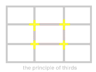
Sometimes placing the center of interest in the geometrical center of
the picture is the right solution, but often it's not. Why? Because
usually it divides the picture into equal halves and makes the image
uninteresting, un-dynamic yet difficult to balance. By dividing the
picture area into thirds, both vertically and horizontally, and locating
the center of interest at one of the intersections of the imaginary
lines, you can usually create a sense of balance in the composition.
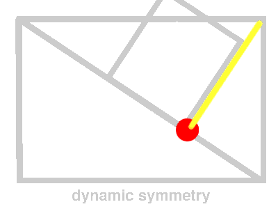
Most photographers and film-makers work with two key options in composition:
The first is the principle of thirds. The other is dynamic symmetry.

In the
principle of thirds, the intersection of lines that divide the picture
area into thirds are marked by yellow segments. These intersections
are good locations for the center of interest in most pictorial compositions.
Notice I said "the" center of interest.

The principle
of dynamic symmetry is a similar idea. A good location for the center
of interest is found by drawing or imagining a diagonal line from one
corner to an opposite corner. Then, draw a second line perpendicular
to the first from a third corner The intersections of the lines (red
spot) is a balanced, yet dynamic, location for the center of interest.
The
Golden Mean
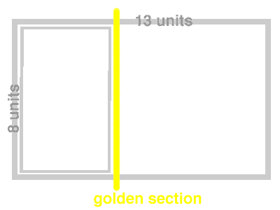
The Golden Mean (or Golden Section), represented by the Greek letter
phi, is one of those mysterious natural numbers, like e or pi, that
seem to arise out of the basic structure of our cosmos. Unlike those
abstract numbers, however, phi appears clearly and regularly in the
realm of things that grow and unfold in steps, and that includes living
things.
The decimal representation of phi is 1.6180339887499... .
You can find it in a number of places: Number Series
If you start with the numbers 0 and 1, and make a list in which each
new number is the sum of the previous two, you get a list like this:
0, 1, 1, 2, 3, 5, 8, 13, 21, 34, 55, 89, 144, ... to infinity-->
This is called a 'Fibonacci series'.
If you then take the ratio of any two sequential numbers in this series,
you'll find that it falls into an increasingly narrow range:
1/0 = Whoa! That one doesn't count.
1/1 = 1
2/1 = 2
3/2 = 1.5
5/3 = 1.6666...
8/5 = 1.6
13/8 = 1.625
21/13 = 1.61538...
34/21 = 1.61904...
and so on, with each addition coming ever closer to multiplying by some
as-yet-undetermined number. The number that this ratio is oscillating
around is phi (1.6180339887499...). It's interesting to note that the
ratio 21/13 differs from phi by less than .003, and 34/21 by only about
.001 (less than 1/10 of one percent!), thus providing our less technically-advanced
ancestors an easy way to derive phi on a large scale in the real world
with a high degree of precision.
This
is the bit that relates phi to composition....
Geometry
If you have a rectangle whose sides are related by phi (say, for instance,
13 x 8), that rectangle is said to be a Golden Rectangle. It has the
interesting property that, if you create a new rectangle by 'swinging'
the long side around one of its ends to create a new long side, then
that new rectangle is also Golden. In the case of our 13 x 8 rectangle,
the new rectangle will be (13 + 8 =) 21 x 13. You can see this is the
same thing that's going on in our number list, but when you discover
it geometrically it looks downright magical. If you start with a square
(1 x 1) and start swinging sides to make rectangles, you wind up with
Golden rectangles without even trying. Here's the list, in case it isn't
obvious:
1 x 1
2 x 1
3 x 2
5 x 3
8 x 5
13 x 8
21 x 13
34 x 21
and so on, with, again, each addition coming ever closer to multiplying
by phi.
Ancient architecture is filled with Golden rectangles.

When you swing the long side of a Golden Rectangle around to create
a new rectangle, the line it forms with the short side is made up of
two sections having lengths of phi and one, respectively. This division
of a straight line into a phi proportion is what is actually meant by
the term 'Golden Section'.
Pure Math
Proportion is the relationship of the size of two things.
Arithmetic proportion exists when a quantity is changed by adding some
amount.
Geometric proportion exists when a quantity is changed by multiplying
by some amount.
Phi possesses both qualities.
If you study the Fibonacci series and the Golden Rectangle carefully,
you will eventually realize that
phi + 1 = phi * phi.
Consider: suppose that you start with a Golden rectangle having a short
side one unit long. Since the long side of a Golden rectangle equals
the short side multiplied by phi, the long side of our rectangle is
one times phi. or simply phi.
Now suppose that you swing the long side to make a new Golden rectangle.
The short side of the new rectangle is, of course, phi units long, and
the long side is that times phi, or phi * phi. This describes a Geometric
proportion.
But we also know from simple geometry that the new long side equals
the sum of the two sides of the original rectangle, or phi + 1. This
describes an Arithmetic proportion.
Since these two expressions describe the same thing, they are equivalent,
and so
phi + 1 = phi * phi.
(Now that we know this, we can discover the exact value of phi. )
The resulting proportion is both arithmetic and geometric. It is thus
perfect proportion; you could think of it as the place on some imaginary
graph where the curved line of multiplication crosses the straight line
of addition.
Derive phi graphically
In pure mathematics, an increase in size can be any imaginable number,
even one like e or pi. But in the world of nature, things always grow
by adding some unit, even if the unit is as small as a molecule. So
it's not surprising that phi turns out to be an ideal rate of growth
for things which grow by adding some quantity.
Some examples:
The Nautilus shell (Nautilus pompilius) grows larger on each spiral
by phi.
The sunflower has 55 (see number list) clockwise spirals overlaid on
either 34 or 89 (see number list) counterclockwise spirals, a phi proportion.
General
Aspects of Balance
There are many other factors to consider in order to make pictures appear
balanced. Some of these are as follows:
• An object far from the center of the picture seems to have more
weight than one near the center.
• Objects in the upper part of a picture seem heavier than objects
of the same size in the lower part of a picture.
• Isolation seems to increase the weight of an object.
• Intensely interesting objects seem to have more compositional
weight.
• Regular shapes seem to have more weight than irregular shapes.
• Elements on the right side of an asymmetrical picture appear
to have more weight than elements of the same size on the left side
of the picture.
• The directions in which figures, lines, and shapes appear to
be moving within the picture area are important to balance; this is
particularily true in photographic or photorealistic representation.
For example, a person may be walking in a direction, or his eyes may
be looking in a direction, or the shape of some element creates a feeling
of movement. When the feeling of direction is present within a scene,
it tends to upset the balance if judged on the size of the subject alone.
Symmetrical,
or Formal, Balance
Symmetrical, or formal, balance in an illustration or photograph is
achieved when elements on both sides of the center of the image are
of equal weight. The idea of formal balance can be related to a seesaw,
When there are two equally weighted objects on the seesaw and they are
equidistant from the pivot point, or fulcrum, the board will be in balance.
Pictures with formal balance may look static and unexciting; however,
they do present an air of formality, even dignity.
Ammetrical,
or Informal, Balance
Asymmetrical, or informal, balance is usually more stimulating and thus
more interesting than symmetrical balance. In asymmetrical balance the
imaginary central pivot point is still presumed to be present; however,
instead of mirror images on each side of the picture area, the subject
elements are notably different in size, shape, weight, tone, and placement.
Balance is established by equalizing the element forces in spite of
their differences.
Asymmetrical balance is introduced when the presumed weight of two or
more lighter objects is equalized by a single heavier object placed
on the other side of the imaginary pivot point. Asymmetrical balance
is usually more difficult to achieve than symmetrical balance, because
of the problem of establishing relative weight values for dissimilar
elements within the picture area as well as presenting some form of
stability.
Viewpoint
The viewpoint for a graphic composition or camera angle for a photograph
is an important factor in composition. Repositioning your subject within
the frame and changing the camera viewpoint or camera angle are two
simple ways of controlling composition.
Photographing from a different viewpoint or camera angle can often add
drama and excitement or even bring out an unusual aspect or characteristic
of a subject. Most of the subjects you photograph are three-dimensional
and should therefore be photographed from an angle (to the right or
left of and/or from higher or lower than the subject) because that allows
the viewer to see more than one side of the subject and therefore experience
the illusion of pictorial space. The photographer should study the subject
from different sides and angles. Walk around the subject and look at
it from all viewpoints. See it from elevated and low positions as well
as from eye level to find the best composition. This greatly assists
in composing the subject for the best balance and helps to select a
background that compliments, not distracts from the subject.
The terms viewpoint and camera angle are often used in conjunction with
one another and sometimes used interchangeably. They can also have different
meanings depending on how they are applied. Viewpoint" is the camera
position in relationship to the subject. "Camera angle" is
the angle in which the camera lens is tilted; for example, a picture
of protestors marching, made from ground level with the camera held
horizontal with reference to the ground, may be referred to as a "low
viewpoint" (or camera position); however, when this picture is
made, again from ground level, but with the camera pointed up, it may
be referred to as a "low camera angle." Likewise, a picture
made from an elevated or high position, with the camera again held horizontal
with reference to the ground, or even pointed straight down, can be
referred to as a "high viewpoint"; however, if the camera
is not held horizontal to the ground or pointed straight down, but pointed
at some angle between horizontal and vertical, the camera position could
be referred to as a "high camera angle."
Eye-Level Shots
With the camera held horizontal, eye-level shots are usualIy made at
a height of about 1.7 meters, the height from which the average adult
sees, and with the camera horizontal. With the camera held at eye level
but pointed up or down, the camera position changes and you have either
a low or high camera angle, respectively.
Low Viewpoint and Low Camera Angle (The "hero
shot")
Low viewpoints and low camera angles can add emphasis and interest to
many ordinary subjects. A low viewpoint can be used to distort scale
or add strength to a picture or to emphasize certain elements within
the picture. A low camera angle is achieved when the camera angle is
located below the point of primary interest and pointed upward. Low
angles tend to lend strength and dominance to a subject and dramatize
the subject. Low angle shots are used when dramatic impact is desired.
This type of shot is very useful for separating the subject from the
background, for eliminating unwanted foreground and background, and
for creating the illusion of greater size and speed.
High Viewpoint and High Camera Angle
High viewpoints and high camera angles help orient the viewer, because
they show relationships among all elements within the picture area and
produce a psychological effect by minimizing the apparent strength or
size of the subject.
|
